Common Store Design Mistakes & How to Avoid Them!

Getting your store design right can be tricky, especially if you have a limited budget or a small space to work with. However, over the 35 years we’ve been in business, there are a number of common store design mistakes that crop up again and again.
Here’s a list of the most common, and easily avoidable, mistakes people make when designing their retail space. Keep these in mind when designing your next retail space and you’ll be sure to wow your customers.
1. Not Designing Your Store with Your Target Market in Mind
No-one’s more important than your target market, right? Then it’s important to keep them at the forefront of your decision making when designing your store. When making decisions about the layout, colour etc. ask yourself, is this appealing to our target market?
Knowing your target market inside and out is vital to creating a great store design. This doesn’t just mean the basics like their age and gender. The real insights lie in understanding their behaviour and their lifestyle. Moulding your store around these insights will…
Take for example, the retail brand Abercrombie and Fitch. Although controversial, their tactics have proven effective at targeting their key demographic of 18-24 year old “All-American,” “cool kids”. Everything from the attractive store greeters at the door to the music they play inside, is aimed directly at this segment.
2. Not Designing a Path for Your Customers to Take Through Your Store
Some research suggests that, in North America, consumers instinctively veer to the right once they enter a store. While in Britain, Australia and Japan, some studies have shown that the opposite occurs. The rotational pattern your customers take is said to corresponding to the side of the road they road drive on. However, this is not an exact science.
When your customers enter your store what direction do they turn? If your customers naturally veer to the right when they enter your store, make sure they have space to do so. Your next job is to make sure that as they do this, they continue walking through your store to maximise their exposure to your products. This not only increases the chances of them making a purchase, but it also helps control the ebb and flow of traffic through your store.
If you don’t set out a clear path for your customers to follow through your store, this can lead to build ups and blockages in certain areas. This dampens the customer experience and can cause your customers to leave your store without having seen all the merchandise you have to offer.
To avoid this, most stores use a circular path to get customers to walk through to the back of the store and come to the front again. In some stores, this path may be highlighted by using a different texture or a different look from the general flooring to further encourage consumers to follow this path.
3. Telling Instead of Showing
Telling someone something will look great on them or in their home is not nearly as effective as showing them. In our experience, the store designs that are the most effective at selling products to consumers, show how their merchandise can be used in the lifestyles of their target market.
To do this, set up merchandise displays that people can identify with it and envisage in their own homes or on themselves. Furniture stores, in particular, use elaborate merchandising displays to sell products to their consumers.
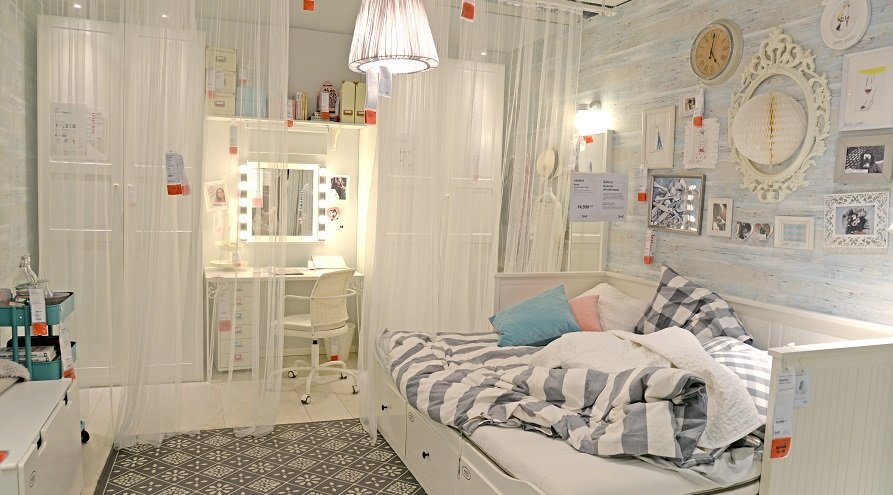
Ikea is a great example of a retailer that does this. It’s product displays showcase entire rooms and highlight how each of its products complements each other. They pick out the products for you, so it’s easy to recreate the entire look in your own home.
This tactic gives your prospective customers an immediate point of reference and as soon as they can clearly imagine your company’s products on themselves or in their homes, they’re as good as sold.
4. Forgetting About the Other Senses
Often store design focuses heavily on visual aspects of design and it can be really easy to focus on just creating visually stimulating displays and forget about the other four senses. However, sight is not the only sense that matters when it comes to selling to consumers. Think about how your store designs sound, smell and feel.
the secret to creating an engaging and immersive experience is to create a multi-sensory experience for your customers. Millennials, in particular, love multisensory environments. According to research by J. Walter Thompson Intelligence, 70% of millennials crave experiences that stimulate their senses.
Therefore, you should create a shopping experience that excites multiple senses simultaneously. Make the most of your brick-and-mortar stores and employ techniques in your physical retail space that you can’t online.
Create an environment that appeals to all the senses. Try utilising soft lighting, playing calming music and wafting enticing scents tailored to your brand. Create a tranquil environment where customers can unwind and enjoy the shopping experience you have to offer. Do this and they’ll spend longer in your stores and come back more often.

5. Not Prioritising the Checkout Area
The checkout area is one of the most important parts of your store design. However, often it can be overlooked as just another thing to incorporate into your store design. As its the location where you’ll intake all your revenue, it’s important that your checkout area is a focal point in the store.
A good rule of thumb to remember is that the checkout should be located at a natural stopping point in the shopper’s path that you’ve created through your store design. So, if your customers naturally take a left turn when they enter and you’ve led them in a circle around your store, a checkout at the front, right-hand side of your store makes sense.
That said, where you place your checkout will also depend on the size and layout of the store itself. This means that ultimately, you’ll have to decide for yourself where the most natural point for the checkout is. For example, if you’re only going to have one member of staff working at a time, it may help to have a checkout area in the centre of the store so you can monitor the whole store effectively.
6. Never Changing Your Store Design
Don’t forget to change it up. Often once people settle on a store design, they seldom change it – even if the design isn’t working for them.
When trying out new store design ideas, it’s important to monitor the results. If something isn’t working, change it. If you’re in the habit of constantly trying out new ideas and testing the results, you’ll soon find a store design that’s right for your business.
Furthermore, don’t be afraid to regularly change your merchandising displays. Consumers get tired of the same old displays. Seeing something new in your store, that they haven’t seen before, grabs their attention.
With over 35 years’ experience, Storebest is Ireland’s leading shopfitters. We know the store design mistakes and how to avoid them. So, if you need help fitting out your retail space, get in contact today. We can provide you with a unique design tailored to your individual needs.